
Increasing
User
Traffic
A newly re-branded drink shop, On the Square Nutrition, was in need of a matching website. A bright and energetic design was created to help more effectively drive traffic to their physical location. Happy customers, a store menu, and a welcoming page about the owners was featured for this effect.
On the Square Nutrition
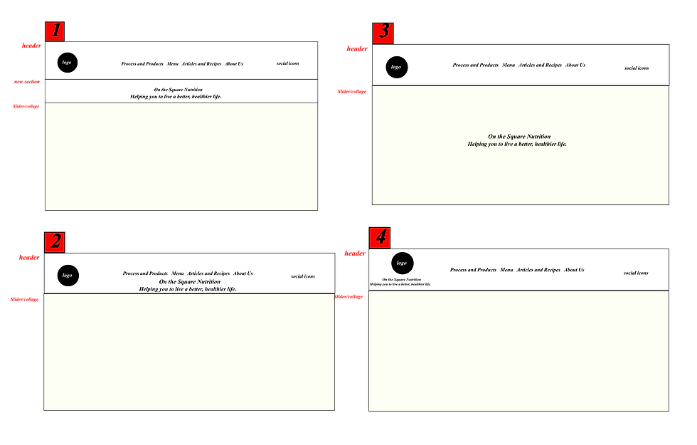
Making Mockups:
Various options were presented to the client for a header and hero image combination. This example contains four of the mockups that were considered for use. Originally the client preferred option three the most, however as the design progressed through various iterations a design more akin to the first one was chosen. This process of establishing design goals, creating options, and testing their results is vital to the design process. With On the Square Nutrition this helped create a final design that better showcased what they most wanted. For them a clear representation of their happy customers came first.
Design Prototyping:

As mentioned before design mockup three was the original hero image choice. The client wanted a clean, yet bright website. With this in mind a dark green font was chosen for various text elements, on top of a white background. Temporary matching green hero images were selected from stock images with the idea of switching them for more personalized options later. What resulted was a sleek and modern design, yet the client was not fully satisfied. They wanted more color with a more fun aesthetic.
Final Product:
In order to bring more color and fun several changes were made. A vibrant green header replaced the white from before. Dark violet text provided nice contrast while bringing a color of their own. A collage of images from inside On the Square Nutrition replaced the concept of one large hero image. Smiling faces and tempting drinks brought in extra life. Finally a pleasingly off-kilter background bordered this collage. Throughout the site similar borders of orange, red, and blue, filled the site with color. This brought the vibrancy that the client was happy with while maintaining full WCAG accessibility standards.
